SERIES Y Brand Identity & Logo Deisgn
SERIES Y Brand Identity & Logo Deisgn
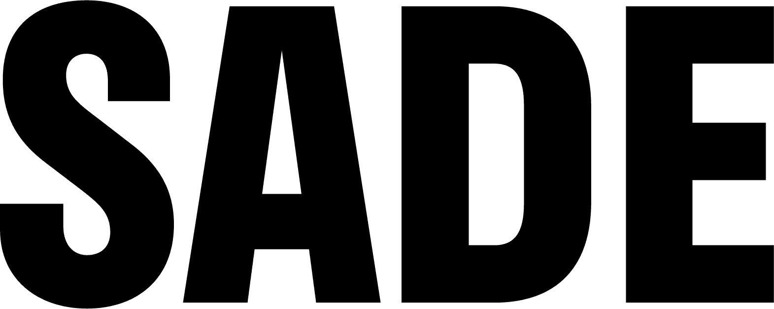
SERIES Y는 모터사이클 라이프스타일을 기반으로 한 퍼포먼스 윤활유 브랜드입니다. SADE는 브랜드의 기술적 정체성과 기능성을 시각적으로 명확히 전달할 수 있도록 산업적 구조감을 갖춘 로고 시스템과 절제된 시각 언어를 중심으로 브랜딩을 진행했습니다. 숫자 기반의 제품 네이밍은 시리즈 확장성과 기능적 위계를 직관적으로 보여주며 로고타입, 패키지, 인쇄물에 이르기까지 일관된 톤을 유지할 수 있도록 시스템 중심의 디자인을 설계했습니다. 차갑고 정돈된 무드 안에서 브랜드의 성능, 태도, 전문성이 선명하게 드러납니다.
SERIES Y는 모터사이클 라이프스타일을 기반으로 한 퍼포먼스 윤활유 브랜드입니다. SADE는 브랜드의 기술적 정체성과 기능성을 시각적으로 명확히 전달할 수 있도록 산업적 구조감을 갖춘 로고 시스템과 절제된 시각 언어를 중심으로 브랜딩을 진행했습니다. 숫자 기반의 제품 네이밍은 시리즈 확장성과 기능적 위계를 직관적으로 보여주며 로고타입, 패키지, 인쇄물에 이르기까지 일관된 톤을 유지할 수 있도록 시스템 중심의 디자인을 설계했습니다. 차갑고 정돈된 무드 안에서 브랜드의 성능, 태도, 전문성이 선명하게 드러납니다.
SERIES Y is a performance lubricant brand rooted in motorcycle culture. To clearly communicate its technical identity and industrial functionality, we developed a branding system built on structural precision and a restrained visual language. The numeric naming system intuitively expresses both product hierarchy and the potential for series expansion. From logotype to packaging and print applications, every element was designed within a cohesive visual framework. Within a cool and composed tone, the brand’s performance, attitude, and expertise are made distinctly visible.
SERIES Y is a performance lubricant brand rooted in motorcycle culture. To clearly communicate its technical identity and industrial functionality, we developed a branding system built on structural precision and a restrained visual language. The numeric naming system intuitively expresses both product hierarchy and the potential for series expansion. From logotype to packaging and print applications, every element was designed within a cohesive visual framework. Within a cool and composed tone, the brand’s performance, attitude, and expertise are made distinctly visible.
SERIES Y is a performance lubricant brand rooted in motorcycle culture. To clearly communicate its technical identity and industrial functionality, we developed a branding system built on structural precision and a restrained visual language. The numeric naming system intuitively expresses both product hierarchy and the potential for series expansion. From logotype to packaging and print applications, every element was designed within a cohesive visual framework. Within a cool and composed tone, the brand’s performance, attitude, and expertise are made distinctly visible.
Industry
Industry
Motor Lubricant
Motor Lubricant
Client
Client
SERIES Y
SERIES Y
Services
Services
Logo design / Brand Identity
Logo design / Brand Identity