Opiém Brand Identity
Opiém Brand Identity
오피엠(Opiém)의 브랜드 디자인은 노화를 부정하기보다 새로운 차원의 아름다움으로 받아들이는 ‘Well-Aging’의 철학을 시각적 서사로 치환하는 작업이었습니다. 저물기 시작하는 오후의 햇살이 가장 부드럽고 아름답게 빛나듯, 시간의 흐름에 따라 깊어지는 우아함을 브랜드의 핵심 가치로 설정했습니다. 햇빛으로 인한 피부 변화에 주목하여 시간이 지날수록 빛나는 건강함을 제안하는 오피엠만의 진정성을 담아내기 위해, 태양의 형상이자 시계의 구조를 결합한 심볼을 중심으로 브랜드 고유의 시각적 세계관을 정교하게 구축했습니다. 시계의 시·분·초이자 태양의 광선을 상징하는 심볼의 12가지 빛은 시간 속에서도 흔들리지 않고 자신만의 빛을 남기는 오피엠의 리듬을 시각화합니다. 이 정서적 안정감은 절제된 그레이 톤인 ‘Concrete’와 노을의 온기를 머금은 ‘Dusk Honey’ 컬러 팔레트로 이어지며, 도시적인 세련미와 자연스러운 생동감을 동시에 전달합니다.
오피엠(Opiém)의 브랜드 디자인은 노화를 부정하기보다 새로운 차원의 아름다움으로 받아들이는 ‘Well-Aging’의 철학을 시각적 서사로 치환하는 작업이었습니다. 저물기 시작하는 오후의 햇살이 가장 부드럽고 아름답게 빛나듯, 시간의 흐름에 따라 깊어지는 우아함을 브랜드의 핵심 가치로 설정했습니다. 햇빛으로 인한 피부 변화에 주목하여 시간이 지날수록 빛나는 건강함을 제안하는 오피엠만의 진정성을 담아내기 위해, 태양의 형상이자 시계의 구조를 결합한 심볼을 중심으로 브랜드 고유의 시각적 세계관을 정교하게 구축했습니다. 시계의 시·분·초이자 태양의 광선을 상징하는 심볼의 12가지 빛은 시간 속에서도 흔들리지 않고 자신만의 빛을 남기는 오피엠의 리듬을 시각화합니다. 이 정서적 안정감은 절제된 그레이 톤인 ‘Concrete’와 노을의 온기를 머금은 ‘Dusk Honey’ 컬러 팔레트로 이어지며, 도시적인 세련미와 자연스러운 생동감을 동시에 전달합니다.
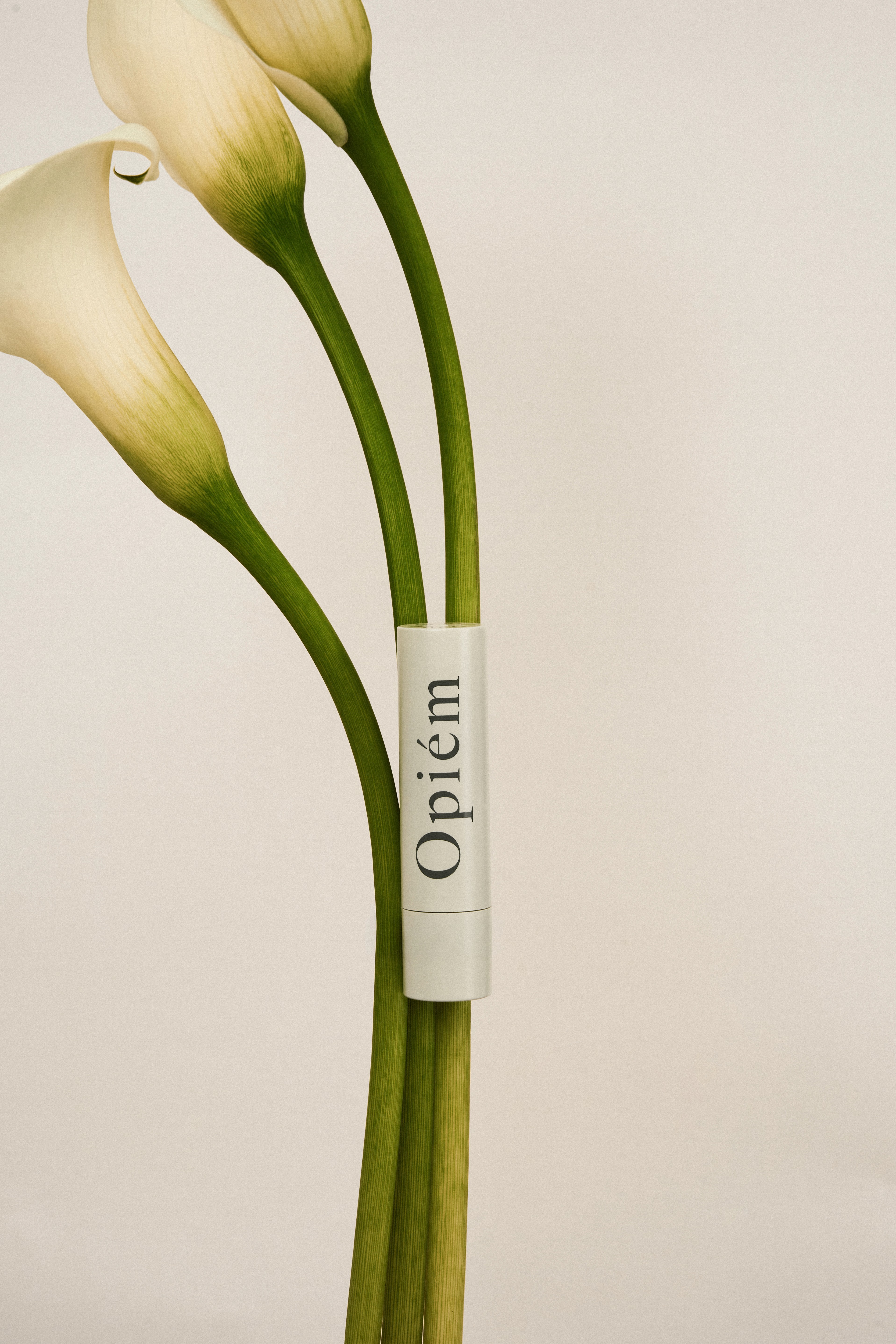
The brand design for Opiém translates the philosophy of ‘Well-Aging’—viewing aging as a transition to a new kind of beauty rather than something to resist—into a visual narrative. Inspired by the soft, radiant glow of the late afternoon sun, we established the core value of elegance that deepens with the passage of time. To manifest Opiém's commitment to skincare that addresses sun-induced changes, we meticulously built a visual universe centered around a signature symbol that seamlessly fuses solar imagery with the structural line of a clock. The twelve rays of the symbol, evoking both the ticking hands of a clock and the radial beams of the sun, visually capture an unyielding rhythm that leaves its own lasting glow within the passage of time. This narrative is further enhanced by a color palette that harmonizes the restrained gray of 'Concrete' with the inviting warmth of 'Dusk Honey,' reflecting both urban sophistication and natural vitality.
The brand design for Opiém translates the philosophy of ‘Well-Aging’—viewing aging as a transition to a new kind of beauty rather than something to resist—into a visual narrative. Inspired by the soft, radiant glow of the late afternoon sun, we established the core value of elegance that deepens with the passage of time. To manifest Opiém's commitment to skincare that addresses sun-induced changes, we meticulously built a visual universe centered around a signature symbol that seamlessly fuses solar imagery with the structural line of a clock. The twelve rays of the symbol, evoking both the ticking hands of a clock and the radial beams of the sun, visually capture an unyielding rhythm that leaves its own lasting glow within the passage of time. This narrative is further enhanced by a color palette that harmonizes the restrained gray of 'Concrete' with the inviting warmth of 'Dusk Honey,' reflecting both urban sophistication and natural vitality.
The brand design for Opiém translates the philosophy of ‘Well-Aging’—viewing aging as a transition to a new kind of beauty rather than something to resist—into a visual narrative. Inspired by the soft, radiant glow of the late afternoon sun, we established the core value of elegance that deepens with the passage of time. To manifest Opiém's commitment to skincare that addresses sun-induced changes, we meticulously built a visual universe centered around a signature symbol that seamlessly fuses solar imagery with the structural line of a clock. The twelve rays of the symbol, evoking both the ticking hands of a clock and the radial beams of the sun, visually capture an unyielding rhythm that leaves its own lasting glow within the passage of time. This narrative is further enhanced by a color palette that harmonizes the restrained gray of 'Concrete' with the inviting warmth of 'Dusk Honey,' reflecting both urban sophistication and natural vitality.
Industry
Industry
Cosmetic
Cosmetic
Client
Client
Opiém
Opiém
Services
Services
Brand Identity / Logo Design / Package Design / Photography
Brand Identity / Logo Design / Package Design / Photography