IUMPAT Brand Identity
IUMPAT Brand Identity
‘이음’이라는 이름이 가진 연결과 흐름의 의미를 시각적으로 구조화한 브랜딩 작업입니다. 기하학적 구조와 라인 요소를 활용해 전문성과 신뢰감을 기반으로 한 단단하면서도 유연한 브랜드 이미지를 설계했습니다. 로고 타입은 고전적인 세리프 구조 위에 균형과 긴장감을 담아 구성되었으며 그리드 위에 구축된 형태는 브랜드의 정밀함과 안정감을 시각적으로 표현합니다. 컬러 시스템, 타이포그래피, 패턴까지 브랜드 전체의 시각 언어가 하나의 흐름으로 이어질 수 있도록 정리했습니다.
‘이음’이라는 이름이 가진 연결과 흐름의 의미를 시각적으로 구조화한 브랜딩 작업입니다. 기하학적 구조와 라인 요소를 활용해 전문성과 신뢰감을 기반으로 한 단단하면서도 유연한 브랜드 이미지를 설계했습니다. 로고 타입은 고전적인 세리프 구조 위에 균형과 긴장감을 담아 구성되었으며 그리드 위에 구축된 형태는 브랜드의 정밀함과 안정감을 시각적으로 표현합니다. 컬러 시스템, 타이포그래피, 패턴까지 브랜드 전체의 시각 언어가 하나의 흐름으로 이어질 수 있도록 정리했습니다.
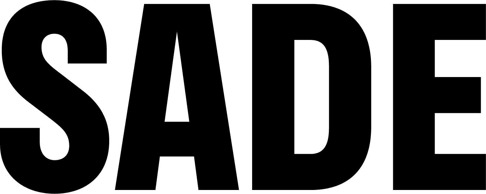
This branding project for IUM IP LAW FIRM visualizes the firm’s core value—connection—through structured, flowing elements. Geometric lines and a balanced layout form a brand image that feels both strong and flexible, grounded in professionalism and trust. The logotype is built on a classic serif structure with refined tension and proportion. Its grid-based construction reflects the precision and stability at the heart of the brand. From color system and typography to patterns and key visuals, each element was designed to flow cohesively as part of a unified visual language.
This branding project for IUM IP LAW FIRM visualizes the firm’s core value—connection—through structured, flowing elements. Geometric lines and a balanced layout form a brand image that feels both strong and flexible, grounded in professionalism and trust. The logotype is built on a classic serif structure with refined tension and proportion. Its grid-based construction reflects the precision and stability at the heart of the brand. From color system and typography to patterns and key visuals, each element was designed to flow cohesively as part of a unified visual language.
This branding project for IUM IP LAW FIRM visualizes the firm’s core value—connection—through structured, flowing elements. Geometric lines and a balanced layout form a brand image that feels both strong and flexible, grounded in professionalism and trust. The logotype is built on a classic serif structure with refined tension and proportion. Its grid-based construction reflects the precision and stability at the heart of the brand. From color system and typography to patterns and key visuals, each element was designed to flow cohesively as part of a unified visual language.
Industry
Industry
Patent Lawfirm
Patent Lawfirm
Client
Client
IUM IP LAW FIRM
IUM IP LAW FIRM
Services
Services
Logo design / Brand Identity / Collateral Design
Logo design / Brand Identity / Collateral Design