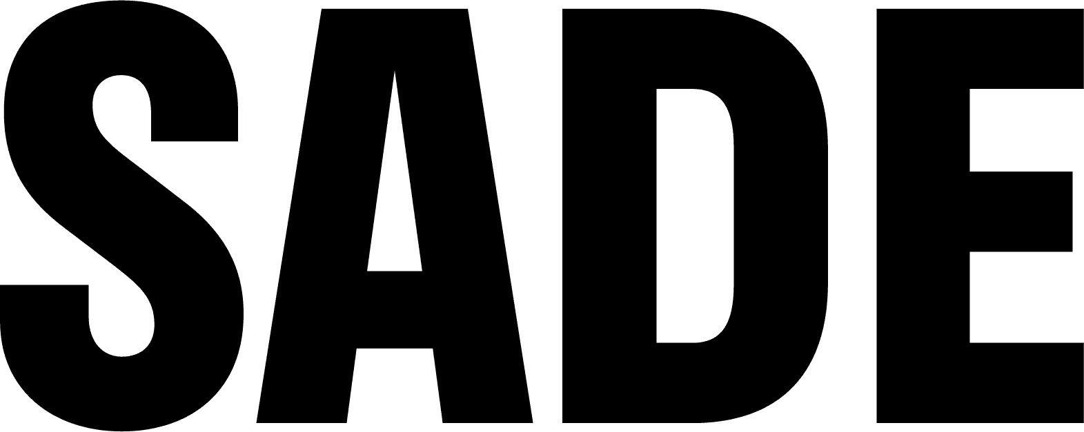
CHOI&LEE LAW FIRM Brand Identity & Logo Deisgn
CHOI&LEE LAW FIRM Brand Identity & Logo Deisgn
최앤리법률사무소는 스타트업과 중소기업에 특화된 법률 서비스를 제공하는 로펌입니다. 최앤리의 브랜드 철학을 기반으로 신뢰와 전문성을 담은 시각 언어를 설계했습니다. 기하학적 구조의 심볼과 안정감 있는 로고타입은 탄탄한 조직력과 명료한 법률 서비스를 시각적으로 표현하며 절제된 컬러와 위계 중심의 타이포그래피 시스템은 브랜드의 신뢰도를 높이는 중요한 역할을 합니다.
최앤리법률사무소는 스타트업과 중소기업에 특화된 법률 서비스를 제공하는 로펌입니다. 최앤리의 브랜드 철학을 기반으로 신뢰와 전문성을 담은 시각 언어를 설계했습니다. 기하학적 구조의 심볼과 안정감 있는 로고타입은 탄탄한 조직력과 명료한 법률 서비스를 시각적으로 표현하며 절제된 컬러와 위계 중심의 타이포그래피 시스템은 브랜드의 신뢰도를 높이는 중요한 역할을 합니다.
CHOI&LEE is a law firm specializing in legal services for startups and small to mid-sized businesses. We developed a visual language that conveys trust and expertise. The geometric symbol and stable logotype reflect the firm’s structured organization and clear legal communication, while the restrained color palette and hierarchy-driven typography system reinforce a sense of credibility and professionalism.
CHOI&LEE is a law firm specializing in legal services for startups and small to mid-sized businesses. We developed a visual language that conveys trust and expertise. The geometric symbol and stable logotype reflect the firm’s structured organization and clear legal communication, while the restrained color palette and hierarchy-driven typography system reinforce a sense of credibility and professionalism.
CHOI&LEE is a law firm specializing in legal services for startups and small to mid-sized businesses. We developed a visual language that conveys trust and expertise. The geometric symbol and stable logotype reflect the firm’s structured organization and clear legal communication, while the restrained color palette and hierarchy-driven typography system reinforce a sense of credibility and professionalism.
Industry
Industry
Law Firm
Law Firm
Client
Client
CHOI&LEE
CHOI&LEE
Services
Services
Logo design / Brand Identity / Collateral Deisgn / Motion Design
Logo design / Brand Identity / Collateral Deisgn / Motion Design